Retina MacBook Pro Review: The Age of the High-Resolution PC
The desktop UI was invented almost 30 years ago. The original Macintosh had a 9” screen at 72 DPI. The modern conventions of size were established by these constraints; a 20-pixel tall menu bar provided a 2” target for the fairly-precise mouse pointer. These constants have stuck with us throughout the lifespan of the desktop, occasionally getting ever-so-slightly smaller as DPI were added to displays here or there. At its peak, the desktop iMac reached about 108 DPI, with 1.5x the pixel density over the 30 year old Macintosh. The MacBook Pro received more improvement, getting as close as 128 DPI on a souped-up 15” model with a “high-res” display. 30 years of progress brought us to 1.77x pixel density. These improvements were great, and always breathed new life into the desktop, but we never managed to break through to a truly high density display where pixels were indistinguishable. Despite years of hoping, it seemed as if we had started to hit a wall in terms of packing pixels tightly together, one that would keep us stuck forever seeing the boundaries of a pixel.
Meanwhile, the mobile revolution happened. The original iPhone blew all of these displays out of the water, with what was (at the time) a ridiculous 163 DPI display. Those of us who were paying close attention to this DPI knew at the time what a big deal this was. The iPad also brought a great 132 DPI display, still higher than the best Apple could put into any desktop or notebook. EDIT: Apparently the 17” MacBook Pros had a display at 132 DPI, so equivalent to the iPad. Soon after, those displays took their pixel density and had it doubled, a feat of engineering that is astounding. The results were truly something else. For most people, the move to a Retina display was immediately noticeable and improved the experience while reading, looking at photos, watching video, and browsing the web. Hopes were renewed that Apple would eventually take this technology back to its roots and bring a Retina-class display to a Mac.
That day has finally come. At WWDC 2012, Apple officially put their toe into the water of the high resolution desktop with the new Retina MacBook Pro. They took the old MacBook Pro’s display and packed four pixels together in place of each one. On top of that, they took the opportunity to do what Apple does best – get rid of dead technology. Software and media are largely delivered via the Internet, so they could get rid of the heavy, noisy, and large optical drive. Spinning disk drives also got the axe, with tiny solid-state drives taking their place. Wireless networking is pervasive and ubiquitous, far more so than wired networks, so they got rid of the Ethernet port. In their place, they put more USB ports, more Thunderbolt ports, and even an HDMI port. By removing all this bulk, they got the MacBook Pro down to just under 3/4ths of an inch thick, and just less than 4.5 pounds.
The new Retina MacBook Pro is a solid foundation on which to build pro-level notebooks for the next few years, and is in every way an improvement on older notebooks. It has a small share of early adopter issues, some of which will require new software updates, some of which will require waiting until next year’s laptop ships. But as someone who has been waiting for a pixel-free world for the better part of a decade, I couldn’t have wished for a better and more focused product from Apple.
Before We Begin…
Prior to getting the Retina MacBook Pro, I was using two laptops, one for personal use, and one for work. I will be making my comparisons against these models:
-
A Mid-2010 15” MacBook Pro, 8 GB of RAM, 500 GB spinning disk drive, and a 1680×1050 matte display
-
A 2011 13” MacBook Pro, 8 GB of RAM, 256 GB solid-state drive, and a 1280×800 glossy display
There will be some screenshots attached to this review. Screenshots presented inline have been compressed and scaled down to fit the blog format, but optimized for Retina displays where available. Clicking the screenshot will take you to a full-size lossless PNG format of the screenshot. Be aware, however, that at 2880×1800 pixels, these screenshots are going to be in the range of several megabytes.
Display
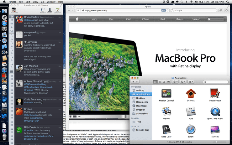
The biggest draw of the Retina MacBook Pro is, of course, its Retina display. Doubled in both directions, it boasts a 220 DPI display that is stunning to look at. While people like to disagree and debate what makes a Retina display, the reality is that pixels are not distinguishable on this display, either when placed on the lap or on a desk with enough room for your arms to type on the keyboard. This leads to the same illusion as viewing an iPhone from close up, or an iPad in your lap; the display falls away and all that’s left is a smooth canvas to work with. The difference cannot be adequately explained in words. Much like when the iPhone pixel-doubled and adopted the Retina display, it sounded great on paper, but its impact was not truly felt until placing your eyes on it for the first time. My first words when I turned on the display and looked at it were “oh wow”. Curves were smoothed out, text looks like print, and photos are unbelievably detailed.
One angle Apple sells on the new display is that, while glossy, it suffers from less of a glare problem due to the way they engineered it. In my daily life I use two laptops (a personal 15” from 2010 with a matte display, and a 13” for my job with a glossy display), so I was intrigued to see how it performed against both. This weekend was particularly sunny in San Francisco, where I live, so I took all three laptops outside (yes, I actually did this, all at once) to try them out. For me there are really two criteria for outdoor use: can I use it outside without problems, and is the effect of sunlight reflection against the eyes uncomfortable? In both cases, the Retina MacBook Pro exceeded Apple’s previous glossy and matte displays, which I did not expect at all. The old glossy display needed full brightness to be usable, and the reflection was sharp and could sting the eyes; it really was not feasible for use in direct sunlight. The matte display, while it smoothed out the sharpness of sunlight, caused the display to appear washed out and difficult to use without squinting. The glossy display on the Retina MacBook Pro, however, was both pleasant and fully readable, even at less-than-full display brightness. The reflectivity, while visible, can be looked through, and didn’t cause any eye discomfort after a half hour of outdoor use in direct sunlight.
Size, Weight, and I/O
By removing the optical drive and the spinning disk drive, the machine has gone almost entirely solid-state. The result on use is striking – the machine is crazy quiet and has barely any internal motion. Previous laptops have always had a slight shudder during use, which has always felt uncanny to me. It has also made the laptop very light, and not trivially so; one handed pickup places much less strain on the wrist and elbow than previous laptops. This will be a big deal if you’re upgrading from any MacBook Pro model shipped previously, but it is still heavier than any MacBook Air. They’ve used this extra space to pack this puppy with battery, and it shows. On a full charge, I got 5 hours of battery with heavy use, with music playing and the brightness turned up, doing power-intensive tasks like compiling with Xcode and manipulating graphics with Photoshop. The placement of the I/O ports along both sides is also a highly welcome addition, as I constantly have smartphones plugged into my laptop, and I no longer have to wrap cables weirdly around my legs to put things where I want them.
One thing I’m not crazy about, however, is the new MagSafe 2 cable. Its design feels like a step back from its predecessor, and it comes disconnected very easily. Perhaps this is due to the fact that Apple continually keeps removing weight from their laptops, and so the reduced force needed to disconnect the cable is a counterbalance to that. But I’ve found myself accidentally disconnecting the cable while moving around on my couch, or moving the cable to a more comfortable position. It’s a small annoyance, but a real one. And unlike previous MagSafe cables, the tiny clip attached to the cable (used for holding it in a wrapped position in a bag) no longer can clip to the bezel of the laptop display, as you could do with previous laptops.
Heat
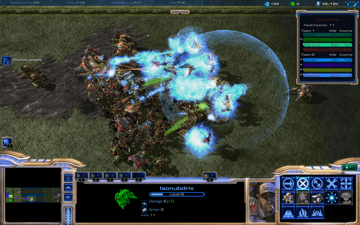
In normal and even heavier use, the Retina MacBook Pro does get warm, but not hot. It does a pretty good job at spreading the heat throughout the body of the laptop, mostly centralized near the top and less from the area where your wrists are likely to lie. When used for gaming, it does heat up a bit more, though. One area which does become unusually warm, especially while gaming, is the tiny metal pieces between the keys of the keyboard. Under normal use, these become very warm, and games send the heat to an uncomfortable level. This is generally not a problem, but if your fingers rest on the keys, they will occasionally fall into the area between keys, creating contact between your finger and the aluminum chassis. Do this with a game like Diablo 3 running and you will quickly feel how hot those contact points can get. This is a pretty significant drawback for me, and in one 30 minute game of Starcraft 2’s Nexus Wars, I counted 12 instances where my finger accidentally fell into that gap, creating a sensation just under a stinging feeling. If you plan on gaming with this notebook, you will probably want to use an external keyboard, or learn to deal with the sensation.
The Retina MacBook Pro contains a new type of fan, with asymmetrical blades. A typical fan has blades that are evenly spaced, which creates a distinct and repeated pattern. This creates two forms of disturbance, one audible and one physical. Symmetrical fans have a distinct white noise that makes them sound like a plane taking off, while also causing a shudder from within the body to be felt by your resting hands on the laptop. The asymmetric fan design of the Retina MacBook disrupts this pattern for an effect that is far less noticeable, creating a quieter sound that doesn’t distract nearly as much. The shudder is still present, but barely. To my ear, the fans seem to ramp up much more slowly, and even after several minutes do not get very loud or distracting. This is a huge improvement in the general fan design, and one which will undoubtedly trickle into the rest of Apple’s laptops. It’s one more area in which Apple focuses on improving a tiny aspect of the experience, but which has profound yet invisible benefits over the lifetime of the machine.
Apps
In the case of both iOS and Mac OS X, which share common ancestry, the OS has found a way to do a lot of the hard scaling work for developers if they play by its rules, drawing text and common controls like buttons with high-resolution artwork. And if you stay within Apple’s stock apps, that’s usually the case. The entire OS has been upgraded with high-resolution images and controls, and the core experience remains fast, fluid, and beautiful. Mail, iTunes, Photo Booth, QuickTime, iCal, Address Book, and the App Store have all been optimized for the new display, among others. Even Apple’s Dashboard widgets got a full high-resolution makeover, and just look amazing. However, as with all early adopter technology, you do have some legacy to put up with. Some of Apple’s own apps, like GarageBand, have not yet been given the full Retina treatment.
Given that the Retina display is barely a week old, it is entirely forgivable that the thousands of Mac apps were not prepared to take advantage of the extra pixels. That said, of the three platforms Apple has with Retina displays (phone, tablet, and notebook), the notebook is easily where low-resolution content is at its most noticeable, and the nature of the Mac and its legacy means that some apps using old APIs will not get any love from the system. For example, Photoshop (and other tools in Adobe’s Creative Suite software) is kicked into an app-wide low-resolution mode, where everything, even the text and controls, are displayed upscaled. Twitter’s Mac app, which uses some funky text rendering scheme, looks terrible on the display, with low-resolution text upscaled. Text is the big area where problems are immediately noticeable, rendering some apps unusable. Images, such as those used in custom controls and things like avatars in a Twitter client, are noticeable, but less so.
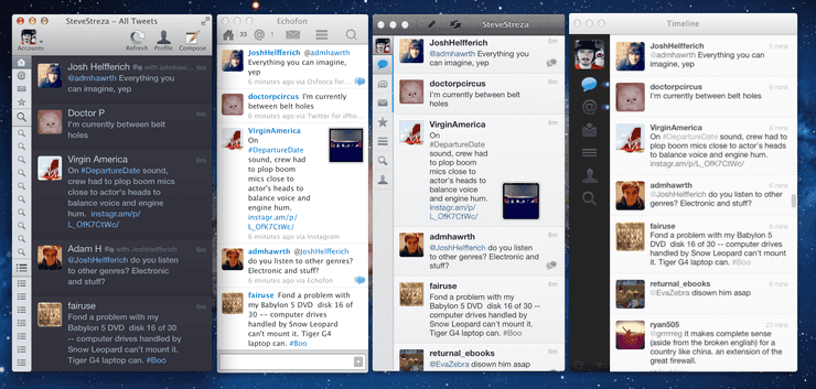
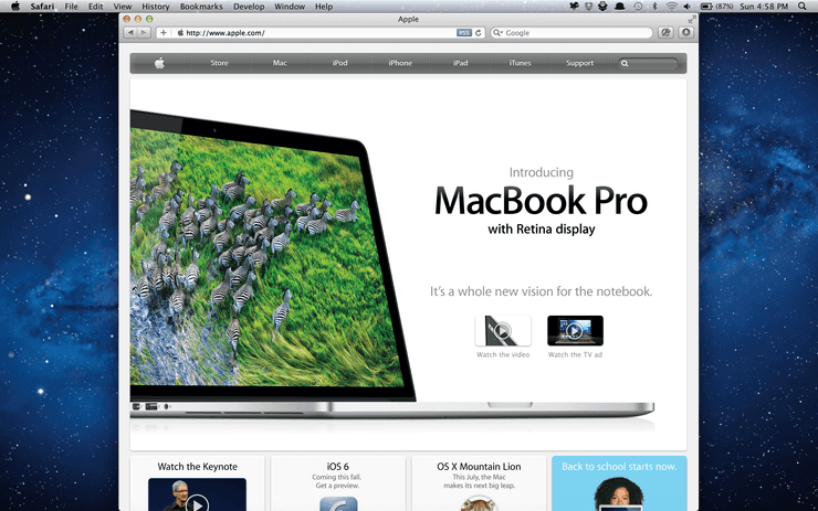
Of course, the Web is also a big part of any computer, and this is also where the low-resolution nature of the desktop really pokes you in the eye. There just aren’t very many sites that have been optimized for a Retina display that target the desktop. This is, of course, to be expected, as those haven’t existed until now, but it is still jarring. Text on web pages is rendered cleanly, as are form elements and CSS styles, but the vast majority of sites with images don’t have Retina graphics yet. This transition is even still happening on the mobile web, where techniques to show Retina graphics have been around for years but are slow to be widely adopted. The same techniques that apply to providing Retina images for mobile web apply to desktop, so at least the frontier is more known this time around. As Retina displays become more ubiquitous, and the techniques for supplying these assets becomes cleaner, there will hopefully be more of an effort to update sites with higher-res graphics. But that process will probably take time. Right now, Safari is the only shipped browser which supports Retina graphics, though the Google Chrome “Canary” experimental builds support it as well.
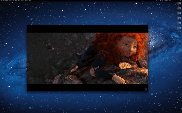
One interesting thing I found is that Apple decided that images should not be displayed at native resolution, but upscaled. In many cases, when you look at an image, you’re seeing that image doubled in size. For example, if you click a link to a standalone JPEG in Safari, that will be upscaled to double its original size, regardless of the DPI embedded in the image. (Curiously, screenshots taken on the Retina display have a DPI of 72 set within the image.) Opening them in Preview and viewing at actual size, however, does display the images with pixel-accuracy. Video also generally is upscaled to 2x. This is actually an interesting problem, as even the most high definition video you can find generally maxes out at 1080P, which is about 40% of the number of pixels on a Retina MacBook Pro. There is some video available in the 4K format, which will downscale to the display, but not much. 1080P video looks great, but it’ll still be upscaled.
Apple’s been pushing developers to modern APIs to accommodate these higher resolution displays for several years. One of the areas they have been pushing developers is to understand the difference between a “point” and a “pixel”. A pixel is a physical dot on the screen that you can put a color value into, where a point is a unit that represents a more abstract relationship between the pixel and the scale factor. A Retina display shows things at 2x the normal resolution, so the menu bar (at 20 points tall) becomes 20 pixels on a non-Retina display (at 1x scale) and 40 pixels when run on the Retina display (at 2x scale). Viewed another way, 1 point multiplied by the scale factor becomes the number of pixels. This is what you want as a developer when upscaling things like controls and UI, but when drawing things like text and images you probably want to target the actual pixels that will be shown. But up until now, with displays at 1x, a point has been a pixel, and the APIs have been improperly used interchangeably, which causes a few minor rendering bugs in some applications. These issues will be fixed over time as developers learn the correct way to use the APIs, and as Retina displays become ubiquitous on the desktop.
Games and Graphics
Four times the pixels means you need one incredible graphics chip to push every one of them around at high framerate. This is an area the Retina MacBook Pro did not skimp on. Both the integrated chipset (used for lower power and reduced performance) and the discrete GeForce GT 650M chipset from Nvidia scream on this machine. The OS itself has been running on the GPU for many years, which provides tons of benefits for apps with smooth and fast animations.
But of course, a machine like this is dying for games, and I was all too eager to try out how some games ran at higher resolution. So far, I’ve put these games on the MacBook Pro:
-
Starcraft 2
-
Diablo 3
-
Galaxy on Fire 2 Full HD
-
Minecraft
-
Kerbal Space Program
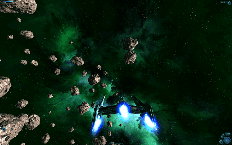
The first three are capable of running in full screen at native resolution; the second two run windowed. In all cases, the performance was astoundingly good. I had Starcraft 2 and Diablo 3 running at 2880×1800 at low-quality graphics with very high framerate. At higher quality graphics, the framerate did stutter a bit, but was still impressive for the resolution. In more intense scenes the smoothness of the gameplay did degrade, especially in one game of Starcraft where there were several hundred units on screen in combat. Blizzard’s games scaled up to the new resolution very well, both for in-game graphics, and game/menu UI. Galaxy on Fire 2 scaled up to the resolution, and looked amazing, but with one drawback – the UI of the game menus didn’t scale with it. This leads to a lot of squinting at very tiny buttons and words, as well as a lot of mouse movement to hit those tiny targets. I’d guess this is a similar problem to the points/pixels issue laid out above, but I’m not sure. It’s just one more tiny (pardon the pun) early adopter issue to deal with, one which will undoubtedly be resolved soon.
Minecraft and Kerbal Space Program are simply pixel-doubled for the higher-resolution displays. In both cases, the gameplay was remarkably smoother than my previous laptops. A game like Kerbal Space Program, with extensive physics and fine-grained control, really requires a smooth framerate to deliver on its promise. With my old laptop, it was very sluggish, especially with more sophisticated rockets. It’s significantly smoother on the Retina MacBook Pro. In general, I’ve seen performance that has been as good or better as a 2 year old laptop with 1/4th the number of pixels.
Nice Touches
An Apple product is all about the details that you don’t immediately notice, but you appreciate immensely more when you do.
-
On the display of all of Apple’s laptops, at the bottom, there is an insignia at the bottom denoting the name of the laptop. This is gone in the Retina MacBook Pro. The bezel is all black, with no note of what the laptop is. While not distracting in prior laptops, it’s just one piece of clutter that I don’t need to see every day, and now I don’t have to.
-
On prior MacBook Pros, the keyboard had an eject button, and the power button was detached from the keyboard and embedded into the corner of the case. Of course, with no optical drive means no eject button is needed. The power button has taken its place, meaning no weird button hanging out in the corner.
-
The optical drive used to take up pretty much the entire right side of the body of the laptop, which meant all of the I/O ports had to be centralized, and thus misbalanced, on the left side. With the Retina MacBook Pro, I can keep different USB devices hanging off each side, I can better organize my cable layout for how I work.
-
The edge around the laptop has been smoothed ever so slightly, as has the thumb tray (where you lift the monitor up to open the notebook). It’s much less sharp on the wrists and on the thumb, making extended typing much more enjoyable. The corners of the thumb tray are, however, still fairly sharp.
-
The sound quality from the built-in speakers is far better than in previous laptops. It seems to emanate from the entire surface of the device, rather than just through two speakers. It’s difficult to describe, but noticeable when in a quiet room.
-
If you connect a second display, it’s probably not going to be a Retina display (at least not yet). Luckily the OS seems to handle this all magically, and downscales the window appropriately and without any input. If you drop the window halfway between the two displays, the one half on the Retina display will be high-resolution, and the other half is downscaled. In other words, it just works.
Denouement
After years of waiting for the needle to move on display technology, we have finally arrived at high-resolution displays with graphics cards capable of driving every one of those 5 million pixels quickly. Apple has taken this incredible and breathtaking technology and put it into a leaner, faster machine that is better in every respect from its pro-level predecessors. And this is certainly just the beginning. I would be surprised if, in the next year, Apple wasn’t putting Retina displays into all of its products, both notebook and desktop. The quality difference is astounding and needs to be seen, in the same sense that it was when the Retina iPhone and iPad came out. This is not incremental progress, this is a technological breakthrough.
Of course, with all breakthroughs in technology come the costs. Early adopters will spend more for this technology, and will derive less benefit from it, than we will two or five years out from now when this same display technology is more ubiquitous. Apps and websites will update to provide high resolution art and fix the bugs associated with high-resolution displays, but on the Mac it will take more time to get to a truly complete Retina experience than it did on mobile. Many apps on this platform have been around far longer, and haven’t necessarily been updated to use the best APIs for things like rendering text. This transition will take time, and early adopters will pay the cost for this transition, as they always have.
But this new display and the shedding of legacy technology like optical drives offers a few key conceptual takeaways. First, Apple is still absolutely dedicated to the Mac, spending a ton of engineering time and effort on the most fundamental component of any portable computer – the display. They’ve built this up as a foundation upon which to build the next five years worth of computers, and they wouldn’t do that without being fully committed to executing that. Part of this execution involves shedding rarely used legacy technologies. But, more importantly, this finally begins the transition to a complete high resolution world of computing. Other manufacturers will compete to bring high-DPI displays to market and customers will benefit. In a few years, displays that have only 100 DPI will be viewed as primitive and difficult to look at. And who knows, perhaps TV manufacturers will begin moving toward the next generation of high-definition TV and film to surpass 1080P video.
For those of us who have been waiting for the high-resolution desktop and the imperceptible pixel boundary for years, this moment is exciting and invigorating. The PC is alive, healthy, and ready to tackle the next several years of innovation and discovery with the new display and the new technical foundation it’s built upon. Welcome to the age of the Retina personal computer, and the new MacBook Pro is a wonderful machine to begin this transition.
