iTunes was released on January 9, 2001, at Macworld San Francisco. It was a huge deal at the time. Like, really huge. The big deal Mac MP3 players at the time, well, sucked as music jukeboxes. They were just that – MP3 players. that left the organization up to the end user. So when iTunes came out and replaced SoundJam MP, it was not only revolutionary, but extremely welcome to those of us with large music collections.
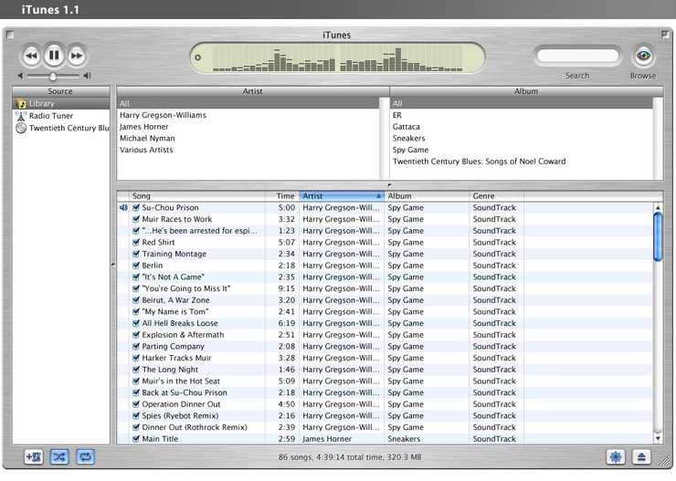
However, iTunes 1.0 was more than just a rebranded SoundJam. It had a completely reworked UI. Gone were the completely horrific looking skins that accompanied it. It was a music jukebox, just like it had been advertised. And Apple made it dead easy to rip, mix, and burn. Suffice it to say, iTunes 1.0 was a pretty amazing app. But Apple didn’t stop there.
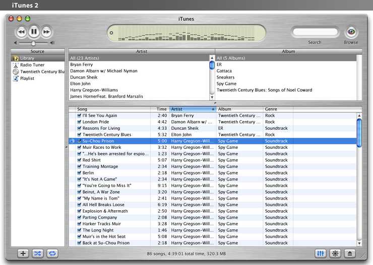
Apple kept chugging along. iTunes 1.1 came out the next month, with support for external burners. But iTunes 2 brought along a ton of new stuff, like an equalizer, iPod support, and crossfading among other things. And yet, the entire interface from iTunes 1 to iTunes 2 saw almost no change – one buton was added to the main window.
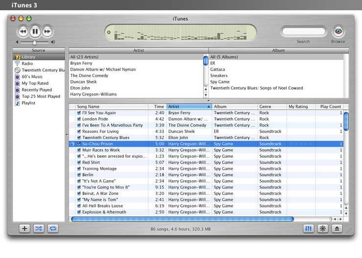
And at this point, Apple could do no wrong. iTunes was maturing and getting better and better, and everyone from music enthusiasts to bloggers to Mac news writers to New York Times journalists was loving it. And when iTunes 3 came out in July 2002, with smart playlists, play counts, sound check, and tons of new stuff, it got acclaim and praise from everyone who looked at it.
“The way Apple graphically presents your music collection in the iTunes UI is inherently logical, and this simplicity eludes the competition. I highly recommend iTunes 3.” – Paul Thurrott
And Apple was on top. Apple had the best music jukebox in the world, smoking anything on the Mac and definitely annihilating anything you could ever find on Windows. Apple was on top, which allowed them to plow forward on Steve Jobs’ next big thing, the iTunes Music Store.
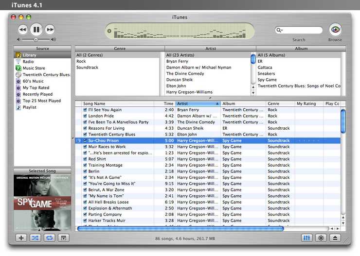
April 28, 2003. The day iTunes 4 was released. The day the iTunes Music Store was launched. Taking a look at the UI, Apple added a single button to the window. But, they also added the “Music Store” button as a permanent fixture to the Source list on the side. The general trend for the interface at this point seems to be “more is better”. But iTunes 4 was still praised as being amazing and revolutionary.
Apple, however, decided to milk iTunes 4 for all they could. Looking at the timeline:
- 4.0: April 28, 2003
- 4.1: October 16, 2003
- 4.2: December 18, 2003
- 4.5: April 28, 2004
- 4.6: June 9, 2004
- 4.7: October 27, 2004
- 4.8: May 9, 2005
- 4.9: June 28, 2005
- 5.0: September 7, 2005
- 6.0: October 12, 2005
- 7.0: September 12, 2006
Some interesting things to notice from that list:
- There were 8 4.x releases, and 0 similarly versioned releases for 5, 6, or 7 (so far).
- iTunes 4.x was available for almost 2 and a half years. iTunes 5.x was available for a month.
- The biggest gap was from iTunes 6 to iTunes 7, a gap of 11 months that was filled with only bug fixes and Nike+iPod support.
- Much of the updates during the iTunes 4 era were adding more and more support and fixes for the iTunes Music Store. Such as adding international stores, iMixes, iTunes gift cards, AOL accounts, etc.
- Apple at this point was very aggressive in marketing iTunes as a music solution, and not just a music organizer with a store attached to it. This explains both the success of iTunes and the direction Apple is and has been heading with iTunes since the advent of the Music Store.
So Apple chugged away for two and a half years on iTunes 4.x, forcing more and more stuff into it. All those things like Party Shuffle and the Music Store quick links kept overcomplicating the UI more and more. So, in typical Apple fashion, rather than fix it, they just glossed over everything and prettied it up.
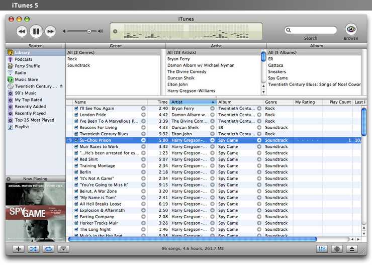
iTunes 5 brought with it a completely new window. Gone was the brushed metal that was a signature style of the app (and no doubt copied by dozens if not hundreds of Mac apps over its history), and in was this new style which had this smooth light-grey-to-dark-grey gradient on the top and bottom of the window. It was more compact, but compactness comes with a cost – the comforting whitespace that iTunes had had since it had launched. Also, the Source list was becoming more and more crowded, as Party Shuffle and Podcasts had been added to the list (although they had been added in iTunes 4.5 and 4.9 respectively). It felt more like iTunes 4.10 than iTunes 5.
iTunes 6 was released one whole month later, for reasons known only to those inside Apple who come up with the arbitrary version numbers for these things. This, like iTunes 5, really felt more like iTunes 4.11. All iTunes 6 added was the ability to buy video through the music store. It also added a “Videos” item to the Source list, further complicating the sidebar. People were starting to get a little hesitant by now to blindly praise iTunes, as it was starting to suffer from feature bloat and performance hits.
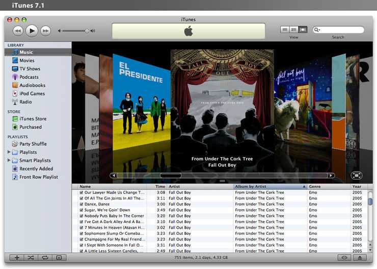
A year after iTunes 6 came out, Apple released iTunes 7. This brought some much needed organization to the sidebar, and added some new ways of looking at your music, but again at the cost of simplicity. iTunes 7 also did a full 360 and redesigned nearly every single control, for reasons completely unknown to the world. Even things like scroll bars were graphically changed.
What happened to iTunes? It went from being an extremely simple and easy to use music player and organizer and became this amalgamation of a music and video player with a complicated interface that seems to embrace just adding more and more. Where did they go wrong?
Quite honestly, the answer lies within the iTunes Store. iTunes 4 marked the beginning of the end, mostly because it saw a shift in how Apple saw iTunes progressing. It no longer became about making it easy for you to organize your music; the priority suddenly became all about making it easy for you to buy your content through iTunes. And that’s where Apple lost its focus.
So what can be done about this situation? We, as iTunes users and iTunes customers, can yell to Apple, but that is probably not going to yield too much of an effect. Perhaps some young and enterprising software developer could effectively rewrite iTunes (say, iTunes 3), and perhaps even rely on iTunes to handle the organization and storage of new content while just acting as a player for the existing iTunes database. What Apple needs to do, first and foremost, is to go back to the drawing board with iTunes, and redesign the interface from scratch. A lot of the metaphors that came with iTunes should stay, such as having the Source list on the left and the music list on the right. But many of the new things should be redesigned or, quite frankly, designed out.
If only it would happen.
Edit: All of the images and most of the research that was done from this post came from a few pages from Wikipedia. And they seemed pretty accurate based on what I remember of the history of iTunes. The page for iTunes, and iTunes’ version history from Wikipedia.


