The new iPad Pro is out and the review are pretty consistent. The hardware is amazing, but held back by the limitations of the software, and that software limitation prevents certain workflows from being viable. Every year that list seems to get a little shorter; Dom Esposito was able to produce his iPad Pro review for YouTube on it (in 4K, no less), Shawn Blanc is doing production photography work on an iPad and a Leica camera, and of course there’s Federico Viticci’s ever-evolving list of workflows to get the most out of the iPad’s multitasking capabilities. With Apple’s silicon team doing some of the best work in the industry, and with GeekBench scores rivaling laptops in bursts, it’s not hard to see why people want to replace desktops with these things; I’ve argued for three years (to the day, apparently) that the iPad Pro needs Xcode.

But there is one type of workflow that, for 8 years, has been difficult to hit on an iPad. Building software.

You don’t want to be limited by the availability of pre-programmed cartridges. You’ll want a computer, like Apple, that you can also program yourself.

Apple print ad, 1978

In many ways, this is a foundational part of the definition of a computer. Apple’s said as much in their ads. The Macintosh has always been an open, developer-friendly platform. And Apple has an excellent and compatible web engine in WebKit that developers can run web apps on. Apple’s history was one that helped small and large companies build Macintosh software, and with Cocoa helped many new developers (including me) build amazing apps for its general purpose computers. But in 2018, it’s an unsolved problem on iPads, one that is viable on competitor tablets like Microsoft’s Surface line and Google’s Pixel tablets. What’s holding it back?

Read More

Owen Williams:

Microsoft, it seems, has removed all of the barriers to remaining in your ‘flow.’ Surface is designed to adapt to the mode you want to be in, and just let you do it well. Getting shit done doesn’t require switching device or changing mode, you can just pull off the keyboard, or grab your pen and the very same machine adapts to you.

It took years to get here, but Microsoft has nailed it. By comparison, the competition is flailing around arguing about whether or not touchscreens have a place on laptops. The answer? Just let people choose.

This coherency is what I had come to expect from Apple, but iPad and MacBook look messier than ever. Sure, you can get an iPad Pro and Apple Pencil, but you can’t use either of them in a meaningful way in tandem with your desktop workflow. It requires switching modes entirely, to a completely different operating system and interaction model, then back again.

The Surface lineup is super compelling now, and Windows continues to get better and better through minor feature updates every few months. Microsoft under its new CEO is cleaning up its act and actually conveying and executing a vision for how the personal computer fits into a modern lifestyle in 2018. At a time when Apple is struggling to remember that it’s creator audience exists, Microsoft is capitalizing on it and giving people what they want.

That said, it’s really silly that the Surface Studio 2, their iMac equivalent, is using a 7th generation CPU when Intel’s 8th generation has been out for months, and some of these are missing USB-C and Thunderbolt 3. There is definitely more work to do to bring these machines to peak performance.

Link

Why the iPad Pro needs Xcode


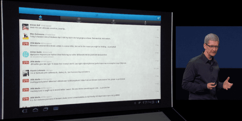
On March 7, 2012, Tim Cook announced their 3rd-generation “New iPad”, leading into it with a (fair and justified) dig at the state of Android tablet apps. Apps like Twitter and Yelp were shown as they ran at the time, with a smartphone-based UI stretched out to fit the wider display. Cook made jokes about apps being hard to see, with small text and lots of whitespace.

The prospect of building iPad apps has not been as popular for developers as building for iPhone. At the same time, iOS as a platform went from having a couple fixed screen sizes to requiring developers design their apps to be flexible. In an effort to bring more iPhone apps to iPad, Apple developed the concept of Adaptive UI, pushing developers away from targeting screen sizes to targeting flexible rectangles with certain size properties.

What Apple wanted to happen was that developers would build a compact UI, and a full-size UI, and the library of iPad apps would naturally expand to have a lot of what was on iPhone. But that didn’t really happen. What happened instead was that many developers design and target for iPhone, then fudge and fiddle with that UI until it looks okay on iPad, leading to (in the worst case) things like what Twitter’s iPad app has now become.

Read More

When I got my first-gen iPad, I stopped using it regularly within a few weeks. It was just too heavy, too big, too thick to really consider using as a replacement for a laptop, or to bring with me places. It’s too heavy to hold for a sustained period of time. In many ways, the iPad mini is what I really wanted the iPad itself to be, and how I want to use it. Smaller, thinner, and lighter than a laptop. Easy to carry everywhere. More immersive than an iPhone. It’s much better suited for the couch, bed, hammock, bus, or car. It’s the size of a book but the weight of a pad of paper.

Today, most iPhone apps are meant to be used in portrait (if not exclusively, then at least primarily). The OS goes out of its way to enforce this; the home screen is in portrait, and locking the orientation restricts you to portrait (even in cases like video and the camera where it makes no sense). On iPad, you can orient the device any way you like, including for the homescreen and orientation lock, but I’d wager that most people use it primarily in landscape. The narrower edge design of the iPad mini seems to encourage more portrait use, which means there may be an awkward early adopter period of apps that aren’t as useful on the mini because they are optimized for landscape over portrait. One possible benefit of the smaller size and the portrait emphasis is that maybe, just maybe, scaled-up iPhone apps won’t look as comically bad on the mini (and don’t scoff, as there are hundreds of thousands of apps that aren’t optimized for iPad). Who knows.

Last week I said I wasn’t going to buy one until I tried it out and felt the size. Oops. I guess we’ll see how it feels when I get mine on Friday.

The iPad mini is basically a small iPad 2. It has an upgraded camera, improved wireless, and a 15% higher density screen. But the screen is only as good as the original iPhone, and it’s running the same 19-month-old A5 processor (which is no slouch, but is hardly state-of-the-art). This is the same chip used in the latest iPod touch, but has more pixels to drive. I wouldn’t be surprised if, even with the non-Retina display, this device feels a little sluggish compared to an iPhone 5, or even a 4S.

The mini certainly fills a need; the current iPad is too large to be truly portable, but is smaller than every notebook you can buy. The iPad has definitely been the dominant player in the 10-inch tablet market, but the 7-inch tablet market has been growing. The leading competition in the 7-inch tablet space is the Nexus 7 (which is a very capable tablet), which will probably end up in a respectable #2 place by the end of 2012 in the area of several million units. It makes sense that Apple would want to try to hold on to the top seat.

The $329 base price point, however, is a strange and awkward place to start the lineup. Not only is this $130 more expensive than the Nexus 7, it misses the psychological barrier of getting under $300. This propagates through the upgraded models as well, and causing a weird staggering effect. In fact, adding in the iPad 2’s and the iPad 4’s price points, we get this pricing chart of 13 prices spread out over 14 models:

Price Model Storage Cell Data
$329 iPad mini 16 GB None
$399 iPad 2 16 GB None
$429 iPad mini 32 GB None
$459 iPad mini 16 GB 4G
$499 iPad 4 16 GB None
$529 iPad mini 64 GB None
$529 iPad 2 16 GB 3G
$559 iPad mini 32 GB 4G
$599 iPad 4 16 GB 4G
$629 iPad 4 16 GB 4G
$659 iPad mini 64 GB 4G
$699 iPad 4 64 GB None
$729 iPad 4 32 GB 4G
$829 iPad 4 64 GB 4G

While there are some overarching rules (e.g. if you want more space, or you want 4G data, you’re paying more), there’s no consistency when you move up or down by one price point. If you were thinking of spending an extra $30, you suddenly have a lot more variables to consider. Perhaps Apple did this to maybe get a few extra dollars out of the customer, but my hunch is that it’ll have the opposite effect. Say you walk into the Apple Store to buy a base model iPad 4 at $499. If you wanted to spend a little more, you could get a slower iPad with 3G, or a smaller iPad with a lot of space you don’t know if you need. On the other hand you could get the iPad mini with the exact same storage, a smaller screen, and 4G data, all while walking out of the store with $40 in your pocket. It’s not a hard conclusion to draw.

In the end, Apple will sell a zillion of them, and they’ll work fine. In a year, Apple will announce the next iPad mini, which will probably include a Retina display, a more modern chipset, and probably a price drop to $299 as well. It just feels like they’re holding some of that stuff back from this version, and it doesn’t seem like price is the motivating factor.

Personally I’m waiting to get one until I actually hold it and try to fit it into my large-but-not-iPad-large jacket pocket. The true test of a device like the iPad mini is its portability. The Nexus 7 fits my jacket, but barely. Hopefully the iPad mini fits as well.